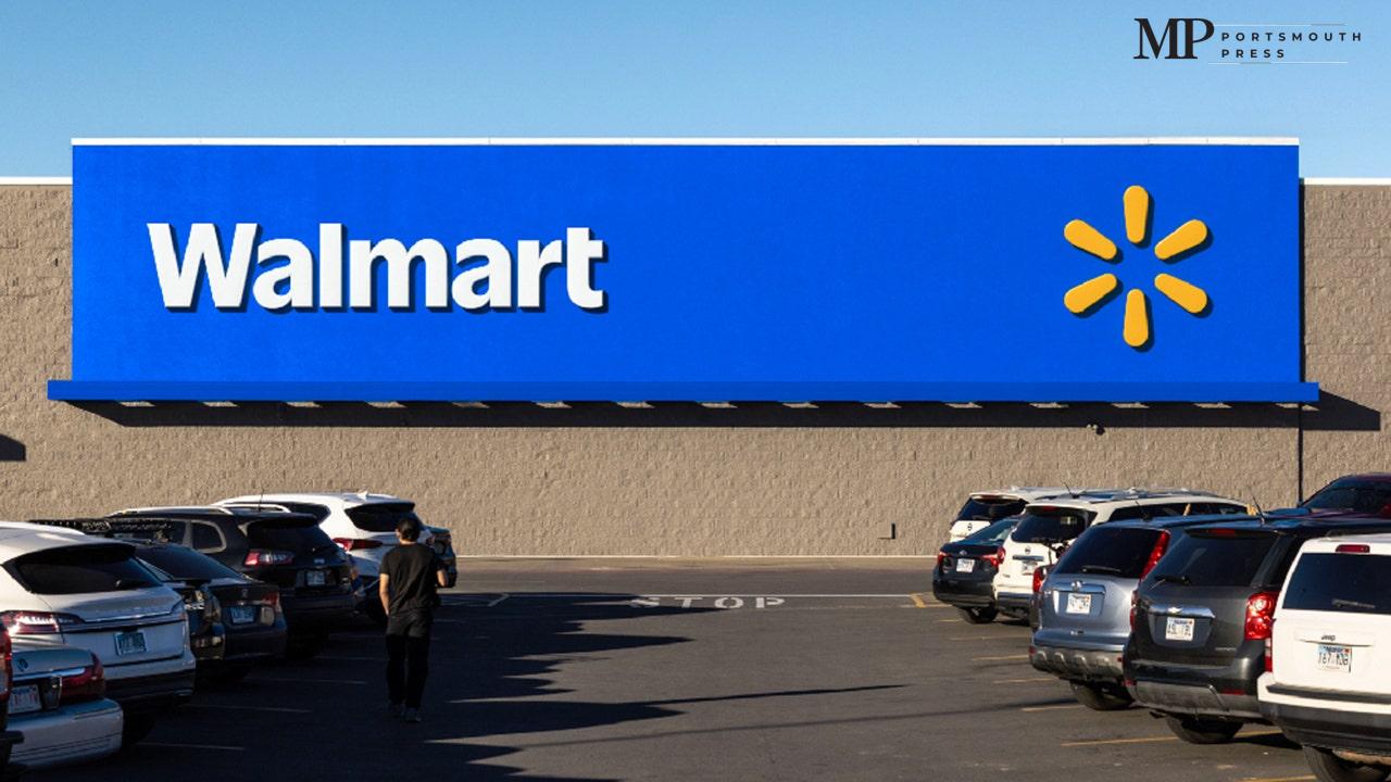
In a bold move marking a significant turning point, Walmart has just unveiled its freshly redesigned logo, the first major update since 2008. With some exciting changes and a modern twist, this new logo reflects the company’s evolution, resonating with the growing digital age that many of us experience every day.
What’s New in Walmart’s Logo?
Walmart’s new logo showcases a bolder typeface with darker blue shades, capturing the spirit of its founder, Sam Walton, and his iconic trucker hat. You’ll still notice the familiar yellow spark—an emblem of energy and innovation—though it has been subtly adjusted to better complement the updated text. This modernization effort is not only about aesthetics; it signifies the company’s ongoing commitment to enhance its connection with customers.
A Rollout Promise
Starting in January 2025, shoppers will begin to see the revamped logo on Walmart’s website, app, and across more than 10,500 stores worldwide. The exciting rollout is in line with Walmart’s strong third-quarter financial performance, which saw revenue soar to $169.6 billion, exceeding Wall Street expectations. This fresh branding comes after a quiet period of nearly two decades, showcasing how much Walmart aims to stay relevant in an ever-evolving retail landscape.
Why the Change?
According to Walmart’s senior vice president and chief marketing officer, William White, this logo redesign captures the essence of Walmart’s journey over the years. He explained that the new look is intended to tell the story of a company that is continually evolving and adapting to meet the needs of its customers. With the rise of online shopping and a larger digital footprint, this logo underscores Walmart’s commitment to enhancing brand credibility and building a stronger bond with its community.
What Customers Are Saying
As news of the redesign spread, social media has been abuzz with mixed reactions. Some customers are excited to see this fresh take, appreciating the new colors and modern font, while others hold a nostalgic affection for the old logo. It’s a classic debate: change can be both exciting and bittersweet. Regardless of opinions, this change is a signal of Walmart’s broader strategy to appeal to a new generation of shoppers.
Modernizing for Connected Shoppers
The updated logo reflects a shift towards a more digital and connected shopping experience. As more customers turn to online shopping, Walmart recognizes that its branding must portray a more modern and friendly image. The thicker letters and brighter colors aim to ensure that Walmart remains not just a household name, but also an appealing destination for today’s tech-savvy consumers.
Walmart’s Expansion and Innovation
This logo redesign isn’t just a cosmetic change; it’s part of Walmart’s overall strategy to bolster its presence in e-commerce. As the company grows, it has committed to not only meeting the expectations of its current customers but also attracting new ones who rely heavily on digital shopping experiences. This brand refresh is intended to reflect their innovation in service and the vast array of products they offer.
Conclusion: A Brand New Look Ahead
Walmart’s logo refresh is not merely about updating a design; it signifies a brand that is committed to evolution, innovation, and customer connection in a fast-paced retail environment. The upcoming changes will surely be met with curiosity and excitement by shoppers across the nation. As we await the official launch of the new logo and its widespread rollout, it certainly feels like a brand new chapter for Walmart.
| Old Logo Features | New Logo Features |
|---|---|
| Traditional font, lighter blue | Bolder font, darker blue |
| Hyphen in ‘Wal-Mart’ | No hyphen, simply ‘Walmart’ |
| Current spark design | Modified spark design |


